Anime Comic Production · 3 / 5
Anime Comic Production 03
ACADEMY MASTERCLASS — Compendium of Anime Comic Book Production
Volume 3: Pacing, Time & Rhythm Across Pages
Issue Reference Prefix: AM-03
Prerequisite: AM-01 — Foundations of Panel Grammar, AM-02 — Page Composition & Layout Architecture
Preface to Volume 3
The first two volumes of this compendium worked at the level of the panel and the level of the page. This volume works at the level above both: the sequence — the run of consecutive pages a reader moves through in one continuous act of reading. Everything established so far (panel transition types, tier structure, visual weight, negative space, layout patterns) was, in a sense, vocabulary. This volume is about syntax — how those units combine across time to control the single most important and least visible variable in comics craft: how fast or slow the reader's experience of time feels, independent of how much story-time has actually elapsed.
This is the volume where the compendium starts treating the comic page the way a film editor treats a cut, because the underlying problem is the same one Tezuka was explicitly solving when he imported cinematic technique into manga in the postwar period: a sequential art page has no fixed duration the way a shot of film does. The reader controls the actual reading speed. What the artist controls is everything that invites a faster or slower reading speed — panel count, panel size, transition type, page density, and the placement of the page-turn itself.
This volume covers: the core toolkit of pacing controls and how they compound across a sequence; the specific mechanics of building tension toward a reveal across multiple pages; the page-turn as a deliberate structural device distinct from anything that happens within a single page; decompression and compression as sustained, multi-page strategies rather than single-page choices; and how TAC's six-protagonist, seven-civilization structure can use pacing shifts as a tool for distinguishing tonal registers across parallel storylines.
3.1 — The Pacing Toolkit: What Actually Controls Reading Speed
Before discussing how these tools combine across a sequence, it's worth naming them precisely, because "pacing" is often discussed vaguely in craft conversations when it is, in fact, built from a small number of concrete, controllable variables.
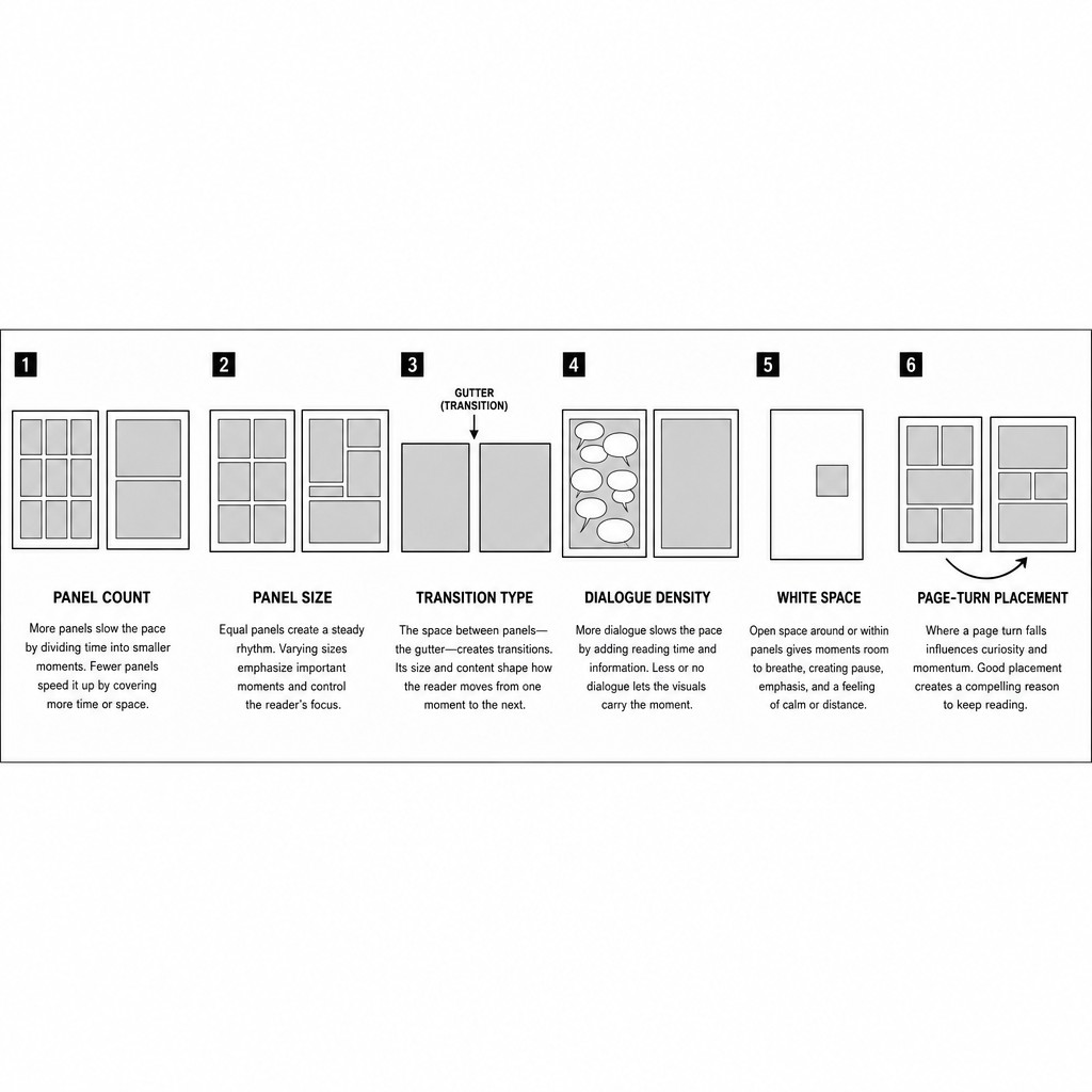
Panel count per page. Established in Volume 1 as panel density — more panels, faster perceived pace; fewer panels, slower perceived pace. This remains the single most powerful lever available to a page designer, because it is the most directly visible to the reader's eye before they even begin reading.
Panel size relative to its neighbors. A page of uniform panel sizes reads at a constant, predictable rhythm. A page with sharply varying panel sizes reads with variable rhythm — small panels compress time, asking the reader to move through them quickly; large panels expand it, asking the reader to linger.
Transition type (per Volume 1's McCloud taxonomy). Moment-to-moment and aspect-to-aspect transitions both slow a sequence down, but for different reasons — moment-to-moment slows it by stretching a single instant across multiple panels (forcing the reader to sit inside a held breath), while aspect-to-aspect slows it by wandering attention across a static scene with no forward time pressure at all. Action-to-action and subject-to-subject transitions are the workhorse "normal speed" transitions. Scene-to-scene transitions, paradoxically, can either accelerate a sequence (skipping over unimportant connective time) or decelerate the experience of the story even while accelerating its plot clock, because the reader has to do more inferential work to bridge the jump.
Dialogue and caption density. Text takes real reading time. A page with sparse or no dialogue is read by the eye alone, far faster than a page dense with word balloons and caption boxes, even if the panel count and size are identical. This makes lettering density (covered fully in Volume 4) a pacing tool in its own right, not merely a content-delivery mechanism layered on top of finished pacing decisions.
White space and negative space (per Volume 2). A spacious, decompressed page slows the reading experience even before any panel content is considered, purely through the visual invitation to linger that empty space creates.
The page-turn itself, addressed in dedicated depth in section 3.4 below, which functions as a pacing tool unavailable to any other narrative medium in quite the same way — film has no equivalent physical-gesture beat, and prose's page-turns rarely carry the same structural weight a comics page-turn can.
These six tools rarely operate one at a time. A genuinely fast-paced action sequence is usually compressing panel count, panel size, transition type, and dialogue density simultaneously — and a genuinely decompressed emotional beat is usually expanding all of them simultaneously. The craft skill is recognizing when a sequence needs all six tools pulling in the same direction (for maximum effect) versus when a sequence benefits from deliberately mismatching them (for example: large, decompressed panel sizes paired with terse, sparse dialogue during a tense standoff, where the visual decompression slows the reader down while the clipped dialogue keeps the content feeling urgent — a combination that produces a very specific "held breath before violence" sensation common in both manga standoffs and the quieter beats of Western crime and action comics).
[AM-03.F01] — Instructional comic-textbook diagram showing a horizontal strip of six small page thumbnails in a single row, each representing one of the six pacing tools labeled beneath it in small sans-serif text: PANEL COUNT, PANEL SIZE, TRANSITION TYPE, DIALOGUE DENSITY, WHITE SPACE, PAGE-TURN PLACEMENT. Each thumbnail is a simplified grey-block page diagram visually illustrating its labeled concept — for example the PANEL COUNT thumbnail shows a dense nine-panel grid beside a sparse two-panel grid, the WHITE SPACE thumbnail shows a mostly-blank page with one small panel. Clean black and white instructional textbook diagram style, uniform thin borders, small clear captions under each thumbnail.
3.2 — Building Tension Across Multiple Pages
A single page can create a localized moment of tension, but sustained tension — the kind that carries a reader through an entire chapter toward a reveal, a battle's turning point, or an emotional confrontation — is built across a sequence of pages, using a deliberate escalation or de-escalation curve in the six pacing tools described above.
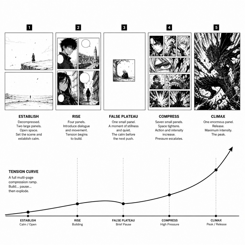
The compression ramp. The most common multi-page tension-building structure in both manga and American action comics: a sequence that begins with comparatively decompressed, lower-density pages (establishing stakes, letting the reader settle into the scene) and progressively compresses — panel counts increasing, panel sizes shrinking, dialogue thinning toward silence, transitions tightening from scene-to-scene down to action-to-action and finally moment-to-moment — as the sequence approaches its climax. The reader experiences this as accelerating urgency even if the in-story clock is moving at a constant rate, because the reading clock is what's actually accelerating.
The false plateau. A specific variant where the compression ramp described above is interrupted by one deliberately decompressed, quiet page placed just before the true climax — a beat of stillness (a character's resolve hardening, a final breath, an aspect-to-aspect lingering shot of a meaningful object) that briefly releases tension immediately before the sequence snaps back into maximum compression for the actual climactic beats. This works because of contrast: the preceding compression ramp has trained the reader's eye to expect ever-increasing urgency, so a sudden quiet page reads as unnervingly calm rather than restful, which paradoxically increases anticipation for what the calm is about to break into. This technique appears constantly in shonen battle manga immediately before a character's decisive attack, and in Western comics immediately before a hero's "now or never" turning-point panel.
The silent build. A sequence that strips dialogue and captions entirely for several consecutive pages, relying purely on panel-to-panel visual storytelling (almost always action-to-action or moment-to-moment transitions) to carry tension. Silent sequences read distinctly faster and more viscerally than text-heavy sequences of identical panel count, because the absence of text removes the reader's only "pause point" within each panel — the eye has nothing to do but keep moving forward through the visual action. This is one of the most reliable techniques for translating TAC's prose-scripted beats into genuinely cinematic comic sequences: any beat in the Scene Function Map tagged with a high-intensity escalation code is a strong candidate for a dialogue-free page run, even if the underlying prose draft contains dialogue — the comic adaptation is permitted, and often improved, by cutting that dialogue entirely in favor of pure visual pacing.
Crosscutting and parallel tension. TAC's structure — six protagonists across seven civilizations — creates frequent opportunities for crosscutting between simultaneous storylines, a technique borrowed directly from film editing and well-established in both manga and Western comics (the alternating-page or alternating-tier structure, where consecutive pages or page-pairs jump between two or more simultaneous threads building toward a shared convergence point). The pacing principle here: each individual storyline's compression ramp should be calibrated independently, but the crosscut rhythm itself (how often the reader is pulled from one thread to another) becomes an additional, page-level pacing tool layered on top of the six listed in section 3.1 — tightening the crosscut interval (jumping between threads more frequently, sometimes down to a single tier per thread) as multiple storylines converge toward a shared climactic beat.
[AM-03.F02] — Instructional sequence diagram showing five small consecutive comic page thumbnails arranged left to right in a single horizontal row, representing a full compression-ramp tension sequence. Thumbnail 1, labeled "ESTABLISH," shows a sparse decompressed page with two large panels. Thumbnail 2, labeled "RISE," shows a page with four medium panels and more visible dialogue balloons. Thumbnail 3, labeled "FALSE PLATEAU," shows a single very sparse quiet page with one small isolated panel and large white space, breaking the escalation pattern. Thumbnail 4, labeled "COMPRESS," shows a dense page with seven small panels and minimal dialogue. Thumbnail 5, labeled "CLIMAX," shows one enormous single panel filling almost the entire page with a dramatic high-impact action moment. Clean black and white instructional diagram style, simplified grey rectangle blocks representing panels, small sans-serif captions beneath each thumbnail, a thin curved arrow beneath the whole row showing the rising-falling-rising tension curve.
3.3 — Decompression and Compression as Sustained Multi-Page Strategy
Volume 1 introduced decompression and compression as single-page panel-density choices. At the sequence level, these become sustained strategic postures that can span an entire chapter, arc, or even a recurring stylistic signature for a specific storyline or civilization within TAC.
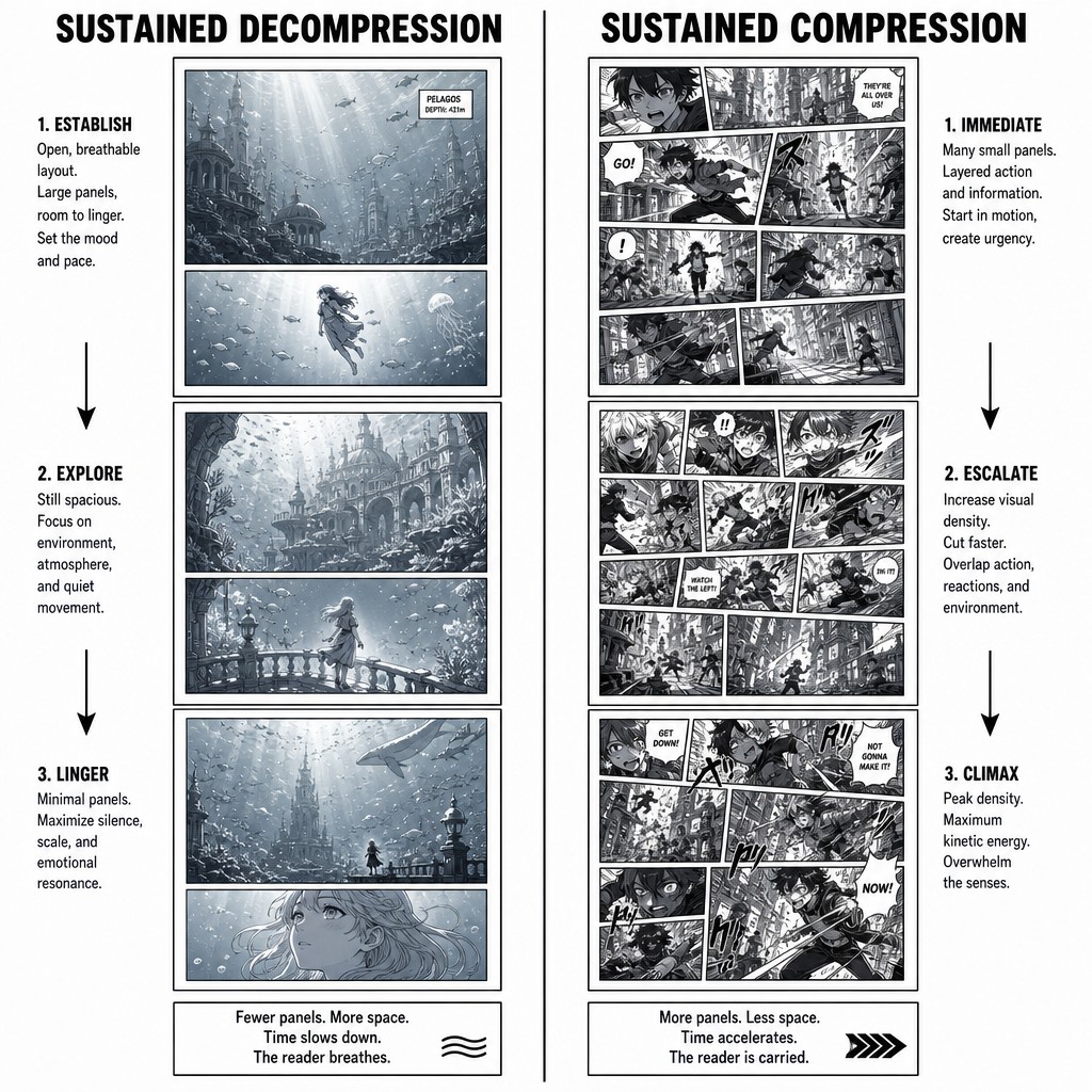
Sustained decompression — multiple consecutive pages maintained at low panel density, generous negative space, and slow transition types — produces what readers and critics often describe as "literary" or "art-house" pacing in comics. This is closely associated with seinen and josei manga traditions (Naoki Urasawa, Inio Asano) and, in American comics, with creator-owned, prestige-format work that emerged partly in reaction against Silver Age compression. Sustained decompression is not merely "slow" in a negative sense — when deployed deliberately, it signals to the reader that the events on these pages deserve unusually close attention, because the pacing itself is telling them to slow down and absorb detail that a faster sequence would not afford time to notice.
Sustained compression — multiple consecutive pages maintained at high panel density, tight transitions, minimal negative space — produces propulsive, page-turning momentum, the sensation of a story that will not let the reader pause. This is the dominant register of shonen battle-manga climax arcs and of fast-paced Western action and crime comics. Sustained compression has a real cost, however: maintained too long without relief, it produces reader fatigue, because the absence of any decompressed breathing room across many consecutive pages removes the contrast that makes compression feel urgent in the first place. A sequence that is uniformly compressed for fifty consecutive pages reads, paradoxically, as less urgent than a twenty-page sequence with two or three decompressed pages strategically placed as the false-plateau technique described above — because urgency, like every pacing effect, is fundamentally relative and contrast-dependent rather than absolute.
Civilization-specific pacing signatures. This compendium recommends TAC's comic adaptation deliberately assign each of the seven civilizations a default pacing register, consistent with its established tonal identity, so that pacing itself becomes a wordless signal of which part of the world the reader is currently in — useful given how frequently the six-protagonist structure will crosscut between simultaneous storylines in different locations. As a starting framework: Crater City and Shadow-Scab sequences lean toward sustained compression (urban density, constant motion, propulsive plotting); Tidalcross and Emberveil sequences lean toward sustained decompression (slower, more atmospheric, more aspect-to-aspect); Drift Coalition and Vortex Station sequences sit closer to a balanced middle register that can swing toward either pole depending on the specific beat; Nova Terra's pacing should be calibrated scene-by-scene according to its narrative function in a given arc rather than carrying a fixed default, given its structural role as the connective civilization across the ensemble cast. This is a recommendation, not a rule — but establishing some deliberate default per civilization, even if individual scenes deviate from it, gives the comic adaptation a consistent visual-rhythm identity that reinforces worldbuilding the same way a film score's leitmotifs reinforce location without needing dialogue to announce it.
[AM-03.F03] — Instructional comparison diagram showing two contrasting comic page sequences side by side, each as a vertical column of three small stacked page thumbnails. LEFT COLUMN labeled "SUSTAINED DECOMPRESSION" shows three consecutive sparse pages, each with only one or two large panels and generous white space, atmospheric quiet anime-style art suggesting a coastal underwater civilization setting. RIGHT COLUMN labeled "SUSTAINED COMPRESSION" shows three consecutive dense pages, each packed with six or more small panels showing rapid urban action and motion, suggesting a dense vertical city setting. Clean black and white instructional diagram style, simplified representative line art inside each thumbnail panel, bold sans-serif column headers.
3.4 — The Page-Turn as a Structural Device
The physical or digital act of turning from one page to the next is unique to sequential print and screen-paginated media, and it has no true equivalent in film (which has no comparable "the audience must perform an action to see what's next" beat) or in continuous-scroll digital formats (webtoons, addressed separately below). Mastery of the page-turn is, by reputation among comics craft instructors in both traditions, one of the hardest skills to teach explicitly, because it requires holding the entire physical structure of the book in mind while scripting — but its underlying mechanics are precise and learnable.
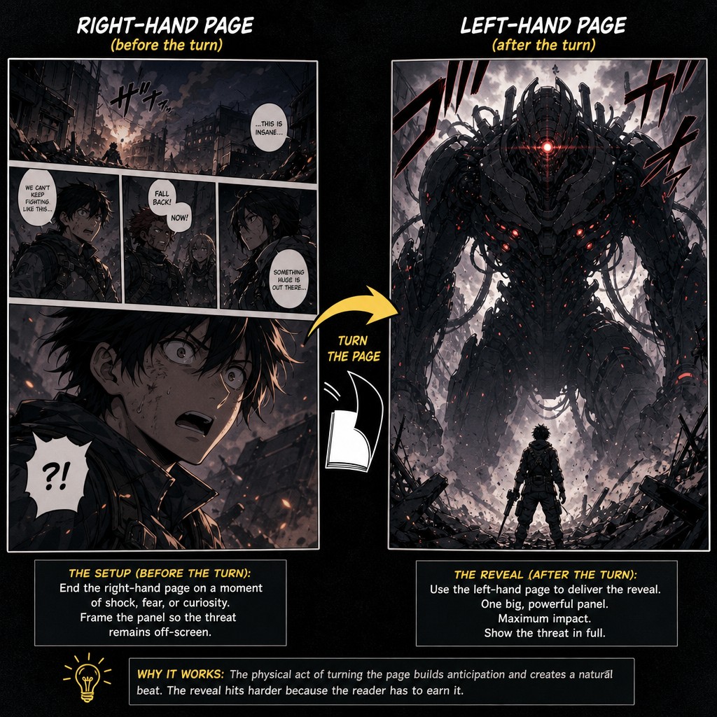
The core mechanic. In a standard bound or paginated digital format, a reader can see the entirety of an open left-right page pair at once, but cannot see the next page pair until they physically or digitally turn the page. This means the right-hand page of any given spread is the last thing the reader sees before that turn, and the left-hand page of the following spread is the first thing they see after it. A page-turn reveal — withholding a key piece of information until the instant of the turn — must therefore be placed as the first panel (often the dominant, largest panel) of a new left-hand page, immediately following a right-hand page that has been deliberately constructed to end on a question, a held breath, or an obscured detail.
Why this differs from a mid-page reveal. A reveal placed mid-page, even a dramatic one, is seen by the reader's eye in their peripheral pre-sequential glance before they've consciously "arrived" at it in reading order (as discussed in Volume 2's treatment of visual weight) — some of its surprise is necessarily blunted by the eye's tendency to scan the whole page before reading it sequentially. A reveal placed as the page-turn's first panel cannot be glimpsed early, because the reader physically could not see it until the turn was completed. This makes the page-turn position the single most reliable location in the entire medium for a true, unspoiled surprise — more reliable even than a same-page splash, which a fast-scanning eye can partially anticpate.
Constructing the "turn page." The right-hand page immediately before a page-turn reveal should be deliberately built to end on uncertainty — a final panel that poses a question (visually or through dialogue/caption), a withheld point-of-view (showing a character's reaction to something the reader hasn't seen yet), or a cut to silence right before an implied event. This is a different skill from ordinary page-ending composition (discussed in Volume 2's treatment of "last panel on the page" weight) because it must specifically court the reader's curiosity about what they cannot yet see, rather than simply concluding the page's own content.
Digital and webtoon-format considerations. SAGE's primary publication context is digital, and depending on final export format (fixed-page digital reader vs. continuous vertical-scroll webtoon format), the page-turn mechanic either fully applies (fixed-page PDF/CBZ-style reading) or must be substantially rethought (continuous-scroll formats have no discrete "turn" at all — instead, vertical scroll position and deliberate large vertical gaps between panels become the rough structural equivalent, a technique extensively developed in the Korean webtoon tradition and one this compendium will return to in a later volume dedicated specifically to format-adaptation). For any TAC content intended for fixed-page reading, this compendium recommends treating the page-turn budget the same way Volume 2 recommended treating the double-page-spread budget: a finite, valuable resource to be spent deliberately on the chapter's most significant reveals, not used reflexively on every right-hand/left-hand page boundary.
[AM-03.F04] — Instructional two-panel diagram demonstrating the page-turn reveal mechanic. LEFT IMAGE labeled "RIGHT-HAND PAGE (before the turn)" shows a comic page ending on a tense final panel depicting an anime character's shocked face looking offscreen at something unseen, mouth open mid-gasp, the panel deliberately cropped so the object of their shock is not visible to the reader. RIGHT IMAGE labeled "LEFT-HAND PAGE (after the turn)" shows the following page opening with one enormous dominant panel revealing what the character was looking at — a massive looming sci-fi creature or mechanized threat emerging from shadow, dramatic high-contrast inking, powerful reveal composition. A bold curved arrow with a small page-turn icon connects the two images to indicate the physical act of turning the page between them. Clean instructional diagram overlay with small labeled captions, dynamic anime and manga-influenced art style throughout.
3.5 — Rhythm Within Dialogue Sequences
A specific and frequently underdiscussed pacing problem is the multi-page dialogue scene — two or more characters talking, often seated or stationary, where there is comparatively little physical action to drive panel-to-panel visual variety. Both traditions have developed reliable techniques for preventing these sequences from reading as visually static or monotonous, despite minimal blocking change scene to scene.
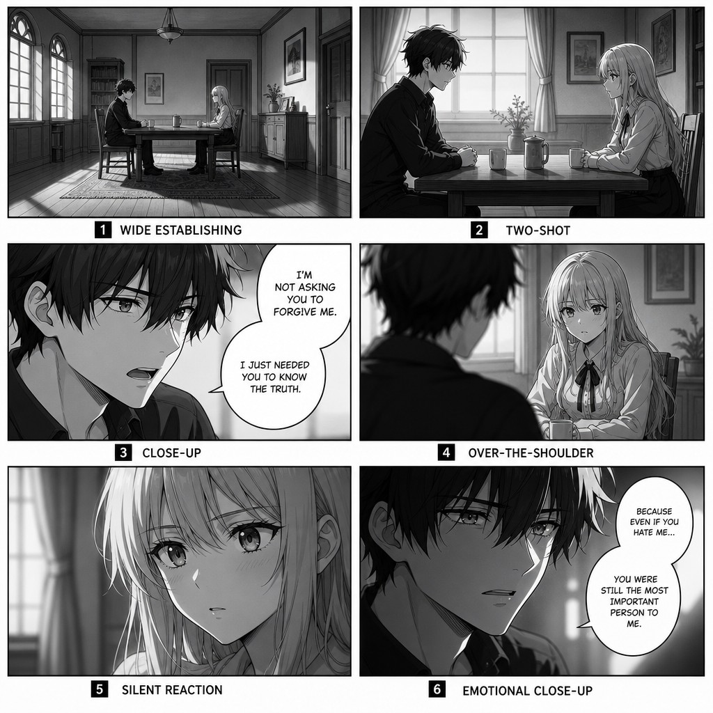
Shot variety across a stationary scene. Even when characters do not physically move, the camera (the artist's chosen angle and framing) should vary panel to panel — alternating between close-ups, medium shots, over-the-shoulder framings, and occasional wider shots that re-establish the room. A dialogue sequence shot from a single repeated angle across many consecutive panels reads as visually flat regardless of how compelling the dialogue itself is; this is one of the clearest places where comics craft directly borrows film's coverage vocabulary (the practice of shooting the same scene from multiple angles to give an editor cutting options).
The reaction panel as a pacing beat. Inserting a silent reaction panel — a character's face processing what was just said, with no dialogue of their own — between two dialogue-heavy panels does real pacing work even though, by McCloud's taxonomy, it is "just" a subject-to-subject transition. The silent beat creates a held breath inside an otherwise fast-reading text-heavy sequence, giving emotional weight room to land before the conversation continues. This is one of manga's most distinctive and frequently borrowed contributions to dialogue-scene craft, and it appears throughout Western decompressed comics as well (Bendis's dialogue-driven Marvel work in particular leaned heavily on this device).
Escalating panel size as emotional escalation within dialogue. A dialogue sequence that begins with small, uniform panels and gradually increases panel size as the conversation's emotional stakes rise — culminating in one large panel for the scene's most significant line — uses the page-level visual-weight tools from Volume 2 as a dialogue pacing device, giving a purely verbal confrontation the same kind of escalating structural weight an action sequence would receive through panel-count compression.
[AM-03.F05] — Instructional comic page diagram demonstrating shot variety in a stationary dialogue sequence: a six-panel page showing two anime-style characters seated across a table from each other in conversation, but each of the six panels uses a distinctly different camera angle and framing — panel 1 a wide establishing shot of the full room, panel 2 a medium two-shot of both characters, panel 3 a close-up on one character speaking, panel 4 an over-the-shoulder shot favoring the other character listening, panel 5 a silent close-up reaction panel showing one character processing what was said with no dialogue balloon, panel 6 a slightly tighter close-up on the first character delivering an emotionally weighted final line. Clean manga-influenced black and white line art, instructional diagram captions beneath each panel naming its shot type.
3.6 — Time Compression Through Captions and Implied Duration
One pacing tool deserves separate treatment because it operates differently from the six listed in section 3.1: the caption box used not for dialogue but for narration that explicitly compresses or stretches story-time independent of what panel transitions alone could communicate. This is a technique with somewhat different conventions in each tradition, and TAC's adaptation pipeline benefits from understanding both.
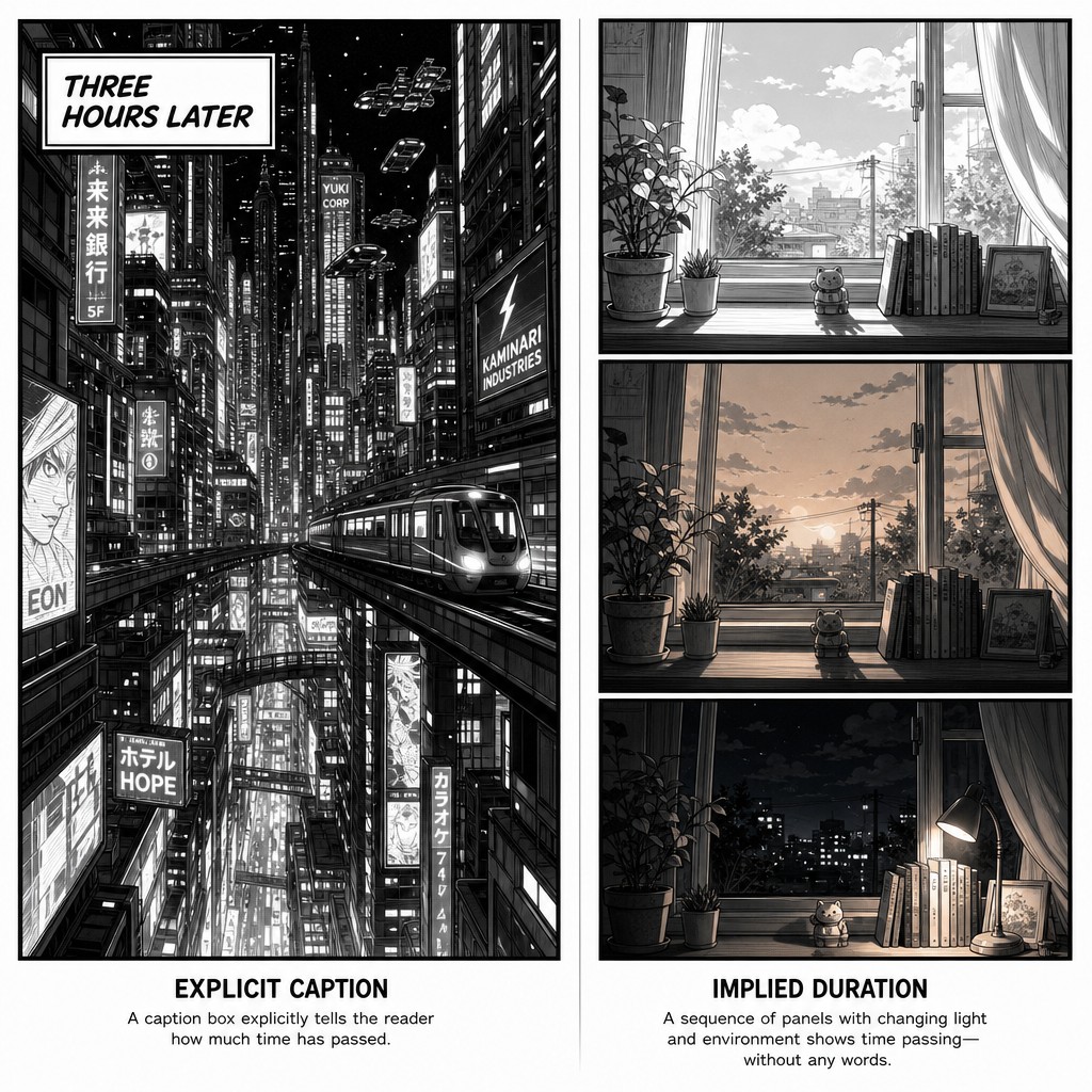
The American convention: explicit time-stamping. Western comics, particularly procedural and ensemble-cast books, have a long-established convention of caption boxes that explicitly name elapsed time or location ("THREE HOURS LATER," "CRATER CITY — LOWER DISTRICT," "MEANWHILE, ACROSS THE GATE NETWORK..."). This convention exists partly because American comics' historically tighter page-count constraints (the 22-page single issue) created pressure to compress large amounts of plot efficiently, and an explicit caption does that compression work in a handful of words that an unmarked scene-to-scene transition would otherwise leave to reader inference. Used well, explicit time-stamping is efficient and unobtrusive; used poorly, it can read as a crutch substituting for visual storytelling that should be doing the same work through panel composition alone.
The manga convention: implied duration through environmental detail. Manga more frequently compresses or signals elapsed time through a held environmental panel rather than a caption — a single quiet shot of a clock, a changing sky (dawn to dusk across consecutive small panels), a cigarette burning down, rain starting and later stopping — letting the reader infer duration from physical detail rather than being told outright. This technique is slower to read (it requires the aspect-to-aspect attentiveness discussed in Volume 1) but produces a more atmospheric, less mechanical sense of time passing, and it avoids breaking the reader's immersion with explicit text the way a caption box necessarily does.
A hybrid recommendation for TAC. Given the project's six-protagonist, seven-civilization structure, explicit captions are likely necessary at location transitions during crosscut sequences (orienting the reader quickly when jumping between simultaneous storylines, where ambiguity about "where are we now" would actively confuse rather than productively mystify), while implied environmental duration is the stronger choice for time compression within a single storyline's continuous scene (where slower, atmospheric inference serves immersion better than an explicit "LATER" caption would). This compendium recommends reserving explicit time-stamp captions specifically for the crosscut-orientation function, and defaulting to environmental implication everywhere else — a discipline that, applied consistently, prevents caption boxes from becoming an overused pacing crutch across sixty episodes' worth of adaptation.
[AM-03.F06] — Instructional comic page diagram comparing two time-compression techniques side by side. LEFT EXAMPLE labeled "EXPLICIT CAPTION" shows a single comic panel of a futuristic vertical city street at night with a bold caption box in the upper corner reading "THREE HOURS LATER," clean American comic book lettering style. RIGHT EXAMPLE labeled "IMPLIED DURATION" shows a sequence of three small consecutive panels with no caption text at all, depicting only a windowsill scene across changing light — panel one shows bright daylight through the window, panel two shows the same windowsill in orange dusk light, panel three shows the same windowsill at night with a lit lamp, demonstrating elapsed time conveyed purely through environmental visual change, clean manga-influenced black and white linework, instructional diagram captions beneath each example.
3.7 — Closing Summary of Volume 3
This volume moved the compendium's focus from the panel and the page to the sequence — the level at which pacing actually becomes legible to a reader. It named six concrete, controllable pacing tools (panel count, panel size, transition type, dialogue density, white space, page-turn placement) and established that genuine pacing mastery comes from deliberately compounding or deliberately mismatching these tools rather than adjusting them in isolation. It covered the compression ramp and the false-plateau technique for building multi-page tension, the silent build as a translation strategy for adapting TAC's prose beats into visual sequences, and crosscutting as an additional pacing layer suited to TAC's parallel six-protagonist structure. It distinguished sustained decompression from sustained compression as full strategic postures rather than single-page choices, and proposed civilization-specific pacing defaults as a wordless worldbuilding signal. It gave the page-turn dedicated treatment as a structurally unique device unavailable to film or prose, with specific construction guidance for the "turn page" that precedes a reveal. It closed with concrete shot-variety and reaction-panel techniques for keeping stationary dialogue sequences visually alive, and distinguished explicit caption-based time compression from manga's implied-duration technique, recommending a hybrid approach suited to TAC's crosscut-heavy ensemble structure.
Volume 4 turns to a subject referenced throughout this volume but not yet treated directly: fukidashi and lettering — the speech bubble's shape vocabulary, tail direction and reading-order discipline, sound-effect lettering conventions in both manga and Western traditions, and the practical craft of placing text so it serves the page's pacing and composition rather than fighting against everything established in Volumes 1 through 3.
End of AM-03. Continue to AM-04: Fukidashi & Lettering.
❦ FIN ❦