Anime Comic Production · 5 / 5
Anime Comic Production 05
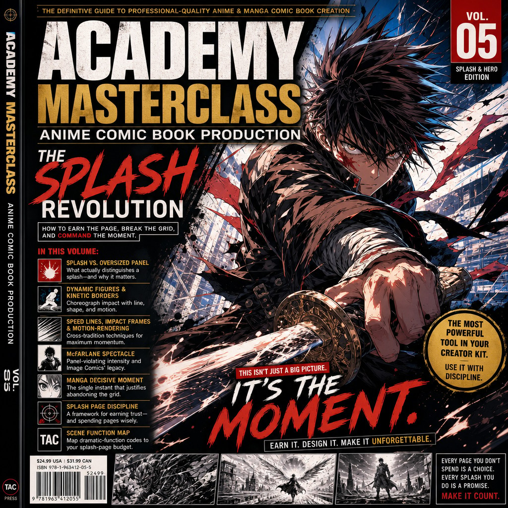
ACADEMY MASTERCLASS — Compendium of Anime Comic Book Production
Volume 5: Action Choreography & the Splash/Hero Page
Issue Reference Prefix: AM-05
Prerequisite: AM-01 through AM-04
Preface to Volume 5
Every prior volume in this compendium has been building toward this one. Panel grammar (AM-01) gave us the border, the gutter, and the grid as a baseline to violate. Page composition (AM-02) gave us visual weight, negative space, and the double-page spread as a separate compositional category. Pacing (AM-03) gave us the compression ramp and the page-turn reveal. Lettering (AM-04) gave us the discipline of treating text as part of composition rather than an afterthought. This volume is where all four converge on the single compositional event the entire McFarlane/Image tradition is most famous for, and that shonen manga treats with equal reverence under different technical vocabulary: the splash page — the single full-page (or double-page) illustration that abandons panel subdivision entirely in service of one overwhelming image — and its close cousin, the hero page, where panel subdivision survives but is bent entirely around showcasing one dominant figure.
This is, by reputation, the most "fun" volume of the compendium to write and the most dangerous one to misuse. A splash page is the single most expensive tool in a comic creator's kit — expensive in literal page-count terms (Volume 2 already established that a double-page spread "spends" two pages' worth of book budget; a single splash spends one full page on what could otherwise have been four to nine panels' worth of plot), and expensive in reader trust terms, because overuse trains the reader to stop taking splash pages seriously as a signal of importance. Used with discipline, a splash page is the most powerful single tool in this entire compendium. Used carelessly, it is the fastest way to make an otherwise well-paced book feel bloated and self-indulgent.
This volume covers: what actually distinguishes a splash from an oversized panel; the anatomy of dynamic figure work and kinetic panel borders as choreography tools; speed lines, impact frames, and motion-rendering conventions across both traditions; the McFarlane-specific contribution of panel-violating spectacle; the manga-specific contribution of the "decisive moment" splash; a disciplined framework for deciding when a beat has actually earned a splash; and how TAC's Scene Function Map dramatic-function codes can map directly onto a splash-page budget for the whole series.
5.1 — What a Splash Page Actually Is (and Isn't)
A common misconception, especially under production pressure, is that "splash page" simply means "a really big panel." This compendium draws a firmer distinction, because the difference has real consequences for how the page should be designed and how sparingly it should be used.
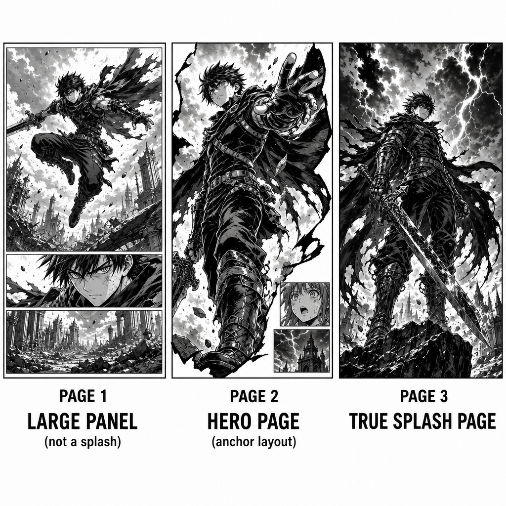
A large panel is still operating within the tier and grid logic established in Volume 2 — it is one panel among others on the page, even if it dominates that page's visual weight. A page with one enormous panel and two smaller panels beneath it (an inverted-pyramid structure, per Volume 2's named layout patterns) contains a large panel, not a splash.
A true splash page abandons the multi-panel page entirely — the entire page is a single image with no panel subdivision at all (or, in some looser house-style usage, a single dominant image with only a small inset panel or two carved into a corner, sometimes called a "near-splash" or "spotlight splash"). The distinction matters because a true splash makes a much stronger claim on the reader's attention and page-budget than even a very large panel does: it says, unambiguously, nothing else is happening on this page except this.
The double-page splash (or "double-truck" in some American production terminology) extends this further still, claiming two full pages — and inherits the spine-gutter discipline established in Volume 2's treatment of double-page spreads. Every double-page splash is a double-page spread, but not every double-page spread is a splash; a spread can still contain multiple panels across its two-page span (a wide establishing tier of panels stretched across a spread, for instance) without abandoning panel subdivision the way a true splash does.
The hero page is a distinct, slightly less extreme category worth naming separately: a page that retains some panel subdivision (often just two or three panels) but is unmistakably organized around showcasing one dominant figure or moment — typically through the Anchor Panel layout pattern named in Volume 2, where the anchor panel claims the overwhelming majority of the page's visual real estate and the remaining small panels function almost as a frame or accompaniment to it rather than as independent narrative beats of equal weight. The hero page is a useful intermediate tool between an ordinary multi-panel page and a true splash — it delivers much of a splash's visual impact while costing somewhat less of the page-budget "currency" a true splash spends, since it can still carry a small amount of additional sequential information (a reaction shot, a connecting beat) that a true splash cannot.
[AM-05.F01] — Instructional comic page comparison diagram showing three distinct page types side by side, clearly labeled. PAGE 1 labeled "LARGE PANEL (not a splash)" shows a page with one large dominant panel occupying the top two-thirds and two smaller panels stacked beneath it, an anime hero figure mid-leap in the large panel. PAGE 2 labeled "HERO PAGE (anchor layout)" shows a page where one enormous panel fills nearly the entire page showing a dramatic dynamic hero figure, with two very small narrow panels tucked into a corner showing a reaction shot and a secondary detail. PAGE 3 labeled "TRUE SPLASH PAGE" shows a single complete page with absolutely no panel borders or subdivision at all, one continuous full-page illustration of a heroic anime-inspired figure in a powerful dynamic pose against a dramatic sky, McFarlane-influenced dramatic inking and dynamic composition. Clean instructional diagram captions beneath each of the three pages, side by side layout, black and white comic art style throughout with bold contrast.
5.2 — Dynamic Figure Work: Choreographing the Pose
Everything else in this volume depends on the foundational skill of drawing (or, in TAC's pipeline, prompting for) a figure whose pose itself reads as kinetic, weighted, and dramatically composed — because a splash page's entire justification rests on the strength of the single image it delivers, with none of the sequential storytelling crutches (additional panels, transition pacing) available to a multi-panel page to carry weaker individual images.
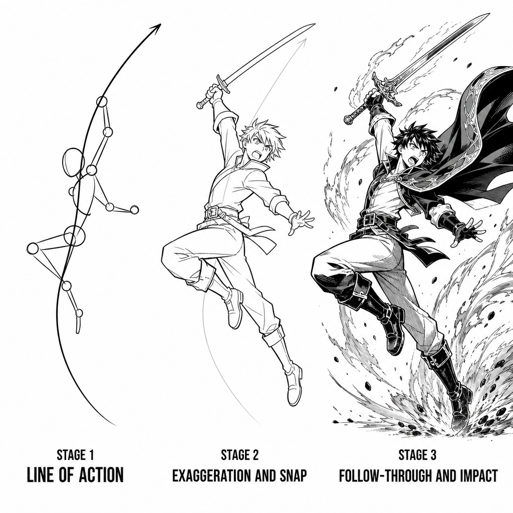
The line of action. The single most important concept in dynamic figure drawing across both traditions: every dynamic pose should be reducible to one continuous, flowing curve or line running through the figure's spine and primary gesture, from which all secondary detail (limbs, props, hair, cloth) radiates or follows. A figure whose line of action is a strong, simple, sweeping curve reads as powerful and intentional even before any rendering detail is added; a figure whose underlying gesture is muddled or contradictory (multiple competing curves fighting each other) reads as static or confused regardless of how much surface detail or rendering polish is layered on top of it. This concept originates in classical figure-drawing and animation theory and is shared, explicitly and self-consciously, by both manga character designers (many of whom, including foundational figures in the medium, came directly from animation backgrounds) and Western action-comic pencillers.
Exaggeration and the "snap." Dynamic action poses in both traditions deliberately exaggerate beyond strict anatomical realism — elongated limbs at the peak of a strike, an impossibly extreme torso twist, a cape or hair rendered as if frozen mid-violent-motion regardless of what gravity or wind would actually be doing at that instant. This exaggeration is not a failure of realism, it is the entire point: a perfectly anatomically accurate pose frequently reads as comparatively inert on the page, because real bodies in real motion rarely hold the single most visually legible instant of an action long enough to be useful as a still image. The skill is choosing and exaggerating the single most legible instant of an action (often called the "key pose" or "snap" in animation-adjacent craft language) rather than the technically accurate instant.
Foreshortening as a spectacle tool. Extreme foreshortening — a fist, foot, or weapon thrust toward the "camera" so dramatically that it appears enormous relative to the rest of the figure's body, which recedes rapidly into the distance — is one of the most reliable techniques for making a static drawn image feel like it is bursting toward the reader. Foreshortening is technically demanding and is, correspondingly, one of the clearest tells of a confident, experienced action artist in both traditions; it appears constantly in McFarlane's highest-impact Spawn pages and throughout the most dramatic "decisive moment" panels of shonen battle manga.
Weight and impact through anticipation and follow-through. Borrowing directly from classical animation principles, a single static image can still imply the motion immediately before and after the captured instant through careful attention to anticipation (the compressed, coiled pose immediately preceding a strike) and follow-through (trailing elements — cloth, hair, debris, energy effects — still completing their motion arc after the figure's main body has already "landed" its pose). A splash page figure that includes visible follow-through elements reads as caught mid-motion, alive within a single frozen instant, rather than posed and static.
[AM-05.F02] — Instructional figure-drawing diagram demonstrating dynamic pose construction, shown as a three-stage breakdown on one page. STAGE 1 labeled "LINE OF ACTION" shows a single bold sweeping curved line with a simplified stick-figure skeleton loosely following its flow, no rendering detail. STAGE 2 labeled "EXAGGERATION AND SNAP" shows the same pose now fleshed out with a simplified anime character silhouette, limbs extended beyond strict anatomical proportion at the peak of a dynamic leaping strike, the underlying line of action curve still faintly visible beneath the figure as a guide. STAGE 3 labeled "FOLLOW-THROUGH AND IMPACT" shows the fully rendered final figure in dynamic action with cape, hair, and energy trail elements all rendered mid-motion trailing behind the main pose, dramatic dynamic comic art style with bold inking, clean instructional diagram captions beneath each of the three stages.
5.3 — Speed Lines, Impact Frames, and Motion Convention
Beyond the figure itself, both traditions have developed a rich, codified vocabulary of graphic motion devices that exist nowhere in the physical world but are universally legible to readers as representing speed, force, or impact. These devices deserve treatment as their own grammar, parallel to the panel-border and balloon-shape vocabularies established in earlier volumes.
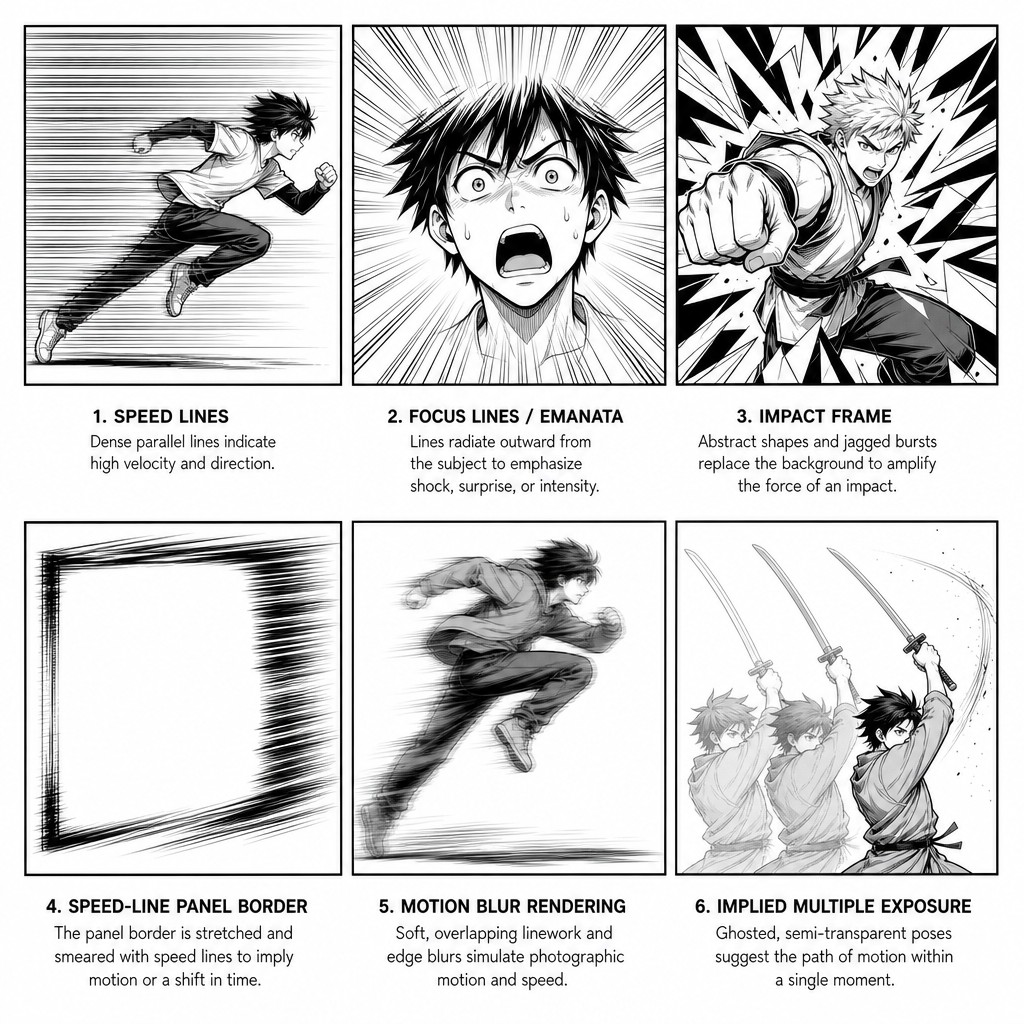
Speed lines (manga: supiido-sen). Straight or gently curved parallel lines trailing behind a moving figure or object, indicating the path and velocity of recent motion. Manga has developed an extremely refined speed-line vocabulary — fine, dense, numerous lines for high velocity; sparse, thick lines for slower or weightier motion; lines that taper and fade for a decelerating motion versus lines that maintain consistent weight for sustained velocity. American action comics use speed lines as well, though generally with somewhat less granular distinction between weight and density, more frequently relying instead on motion blur rendering (a figure's edges rendered with soft multiplied or overlapping linework suggesting a photographic motion-blur effect) as an alternative or complementary technique.
Focus lines / emanata radiating from a point. Lines radiating outward from a fixed point (rather than trailing behind a moving figure) are used to direct the reader's eye toward a specific focal point in the panel — frequently a face at a moment of shock, or the central point of an explosion or energy blast. This device, sometimes generally grouped under the Japanese term emanata (a term coined originally in Western comics scholarship to describe symbolic devices radiating from a character, but useful as an umbrella term here), appears extensively in manga for emotional emphasis and in Western comics primarily for explosive or energy-based effects.
Impact frames. A nearly fully abstract burst pattern — radiating jagged lines, sometimes combined with a contrasting flat color or heavy black field — placed behind a panel's primary subject at the exact instant of a critical strike, revelation, or emotional gut-punch. This device, extremely common in shonen manga (where it frequently replaces detailed background art entirely for a single panel, the abstraction itself communicating that the moment matters more than any literal background context would), has a less codified but recognizable equivalent in American comics, generally rendered as a more literal halftone or radiating-line burst rather than manga's more stylized geometric pattern.
Speed-line panel borders. A technique combining the panel-border grammar from Volume 1 with the motion-convention grammar of this section: rendering the panel's own border as if it is itself in motion — angled, smeared, or partially dissolved into speed-line strokes rather than a clean static rectangle — reinforcing a high-velocity moment at the structural level of the panel itself rather than only within its internal content. This is a more aggressive, less common technique in both traditions, reserved for the highest-intensity beats.
Motion within a single panel via implied multiple exposure. A technique, more common in Western action comics than manga, of rendering a single figure's limb or weapon at several semi-transparent or ghosted positions within one panel to imply the path of a very fast strike — visually similar to a long-exposure photograph or stroboscopic image. This is a comparatively rare, highly stylized technique reserved for the single fastest or most pivotal strike of a sequence, since its visual unusualness (most action art does not use it) is precisely what gives it impact when deployed.
[AM-05.F03] — Instructional comic reference sheet showing a clean 2x3 grid of six labeled motion-convention examples, each a small simplified panel demonstrating one technique. Example 1 "SPEED LINES" shows a running anime figure trailing fine dense parallel speed lines behind it. Example 2 "FOCUS LINES / EMANATA" shows a shocked character face with lines radiating outward from the center of the face toward the panel edges. Example 3 "IMPACT FRAME" shows a fighter delivering a punch against an abstract radiating jagged burst pattern background replacing any literal scenery. Example 4 "SPEED-LINE PANEL BORDER" shows a panel whose rectangular border itself appears smeared and angled into motion-blur strokes rather than a clean static rectangle. Example 5 "MOTION BLUR RENDERING" shows a leaping figure with soft overlapping multiplied edge linework suggesting photographic blur. Example 6 "IMPLIED MULTIPLE EXPOSURE" shows a sword-strike arm rendered at three semi-transparent ghosted positions tracing the path of the swing within one panel. Clean black and white instructional comic art textbook diagram, small sans-serif captions beneath each example.
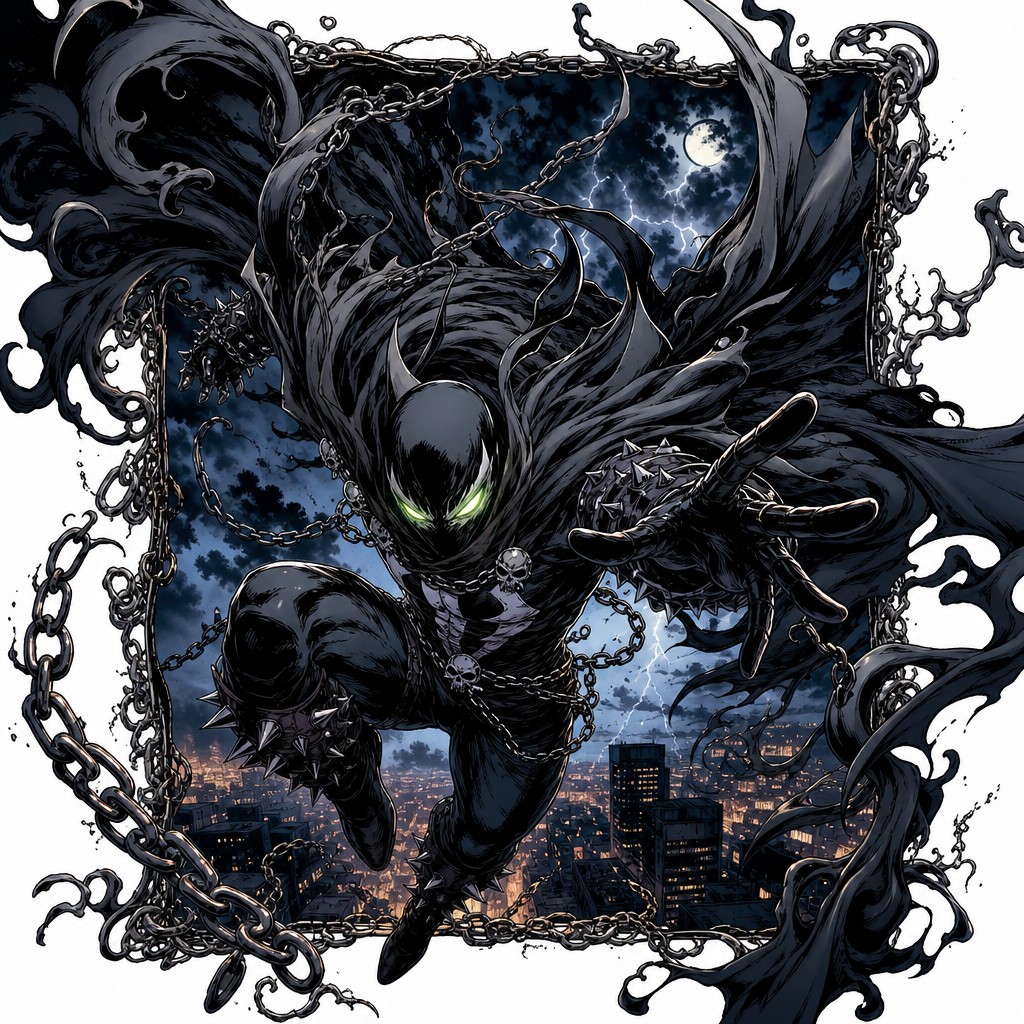
5.4 — The McFarlane Contribution: Panel-Violating Spectacle
Volume 1 introduced "panel violation" — a figure or effect physically crossing a border it should logically be contained by — as a McFarlane-associated technique. This section gives it the dedicated treatment it deserves as a splash/hero-page tool specifically, because panel violation is most powerful precisely at the scale this volume is concerned with.
The mechanism of panel violation. When a figure (most famously, in Spawn's case, a cape rendered as an enormous, almost architecturally elaborate mass of fabric and chain) is drawn extending past the edge of its own panel border — overlapping into the gutter, or even physically overlapping a neighboring panel's space — the reader's eye registers a specific, visceral sensation: that the contained energy or power of the figure exceeds the page's own structural capacity to hold it. This is, in effect, the comics-page equivalent of a film character breaking the fourth wall, except the "wall" being broken is the medium's own structural grammar rather than a narrative convention — which is precisely why it reads as so much more aggressive and destabilizing than an ordinary dramatic panel.
Ornate, diegetic borders as an extension of the same idea. As established in Volume 1, McFarlane-tradition borders are frequently constructed from in-world material (smoke, chains, organic tendrils) rather than a neutral ruled line. Combined with panel violation, this produces a specific compounded effect: not only does the figure's power exceed the panel's containment, the panel's own boundary is depicted as a struggling, straining material object (chains visibly creaking under tension, smoke curling as if displaced by force) rather than an inert frame — the border itself becomes a participant in the page's drama rather than a neutral container of it.
Negative space as engineered chaos. Despite their visually maximalist, chaotic-seeming first impression, the most successful McFarlane-tradition splash and hero pages are, on close structural analysis, very carefully composed using exactly the visual-weight principles established in Volume 2 — size, contrast, detail density, position, and isolation are all still operating, just pushed to a more extreme register than an ordinary page would use. The apparent chaos is, in the best examples of this style, a controlled illusion: a single dominant line of action (per section 5.2) still organizes the whole page, and the "violating" elements (the burst cape, the broken border) are placed with the same compositional discipline Volume 2 established for ordinary pages — they simply push past conventional containment rather than abandoning composition altogether. This distinction matters enormously for TAC's production: genuinely undisciplined panel violation (chaos for its own sake, without an underlying organizing line of action or weight hierarchy) reads as a mess; disciplined panel violation, built on the same foundational principles as every quieter page in this compendium, reads as spectacle.
[AM-05.F04] — A dramatic full hero page in the style of Todd McFarlane Spawn-era Image Comics, depicting a powerful anime-influenced anti-hero figure in mid-leap, an enormous dark tattered cape made of chain and smoke-like fabric trailing and billowing dramatically, the cape physically bursting past the irregular jagged organic panel border that frames the rest of the page and extending into the white gutter space outside it. The panel border itself appears constructed from twisted chain links and curling smoke tendrils rather than a clean ruled line, with small visible strain details suggesting the chains are creaking under the force of the figure power. Heavy chiaroscuro inking, dramatic high-contrast black spotting, dynamic foreshortened pose with a single strong sweeping line of action running through the figure, intense glowing eyes, dramatic atmospheric lighting against a stormy sky background. This should read as a genuinely impressive, original, dynamic hero splash page combining manga-influenced character design with 1990s Image Comics dramatic inking and panel-violation technique.
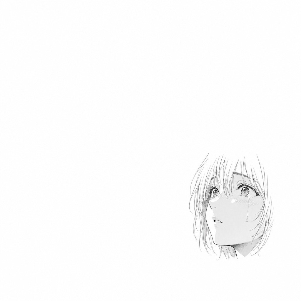
5.5 — The Manga Contribution: The Decisive Moment Splash
Where the McFarlane tradition's splash pages tend toward maximalist visual chaos in service of raw power and spectacle, manga's most celebrated splash and near-splash pages frequently achieve comparable dramatic weight through a nearly opposite technique: radical compositional simplicity at the instant of maximum significance — what this compendium will call, adapting standard craft terminology, the decisive moment splash.
The mechanism. Rather than filling the page with maximal detail, motion lines, and competing visual elements, a decisive-moment manga splash frequently strips away almost everything except the single most essential element of the moment — a character's face at the instant of a critical realization, rendered with minimal background, minimal motion convention, and enormous surrounding negative space. The dramatic weight comes not from visual density but from the sheer, unbroken privilege of an entire page being devoted to one simple, undiluted image — the page-budget expenditure itself (an entire page "spent" on a single still face) becomes the carrier of the emotional weight, independent of how much is actually rendered within that page.
Why this works precisely because of everything established in Volume 3. This technique is the purest possible application of the false-plateau and decompression-as-strategy concepts from Volume 3, taken to their logical extreme: if a quiet, decompressed page reads as dramatically privileged because of the contrast it creates against busier surrounding pages, then an entire splash page built around radical simplicity is, in effect, the maximum possible expression of that same contrast principle — the biggest possible page-budget expenditure on the smallest possible amount of rendered content, which is precisely what makes it land as overwhelming rather than as a missed opportunity to fill the page with more spectacle.
When to use which tradition's approach. This compendium recommends TAC's production treat the McFarlane-maximalist splash and the manga-minimalist decisive-moment splash as two distinct tools suited to two distinct narrative purposes rather than as competing approaches to be chosen between arbitrarily: reserve maximalist panel-violating spectacle splashes for beats where the story's stakes are fundamentally about power, scale, or physical confrontation — Anima Principle awakenings, Crown Heist action climaxes, Noctura's transformation phases — and reserve minimalist decisive-moment splashes for beats where the story's stakes are fundamentally about internal realization, emotional turning points, or quiet revelation — a protagonist's private moment of understanding, a relationship's breaking or mending point, the instant a character commits to an irreversible choice. Both are full splash pages spending the same page-budget currency; the choice of which register to spend it in should follow directly from the Scene Function Map's dramatic-function tagging for that specific beat.
[AM-05.F05] — A decisive-moment manga-style full splash page in stark contrast to a maximalist action splash: a single anime-style character close-up face filling roughly one-third of an otherwise almost entirely blank, pure white page, the character expression caught in a quiet instant of profound internal realization, eyes slightly widened, a single subtle tear or trace of emotion, minimal fine linework with no background detail at all, no motion lines, no speed effects, no other elements anywhere else on the page beyond the single small precisely placed figure and an enormous surrounding field of negative space. The composition should feel deliberately restrained, quiet, and emotionally overwhelming purely through scale contrast and isolation, clean delicate manga-influenced linework, soft minimal shading, evoking a profound, intimate emotional turning point.
5.6 — A Disciplined Framework for Earning a Splash
Given everything established about the page-budget cost of splash pages (Volume 2's spread-frequency-as-budget principle, extended here to single-page splashes as well), this compendium closes with a concrete, practical framework for deciding whether a given beat has actually earned a full splash or hero page, rather than leaving the decision to artistic impulse alone.
The "could this be a panel instead?" test. For any candidate splash beat, ask whether the same dramatic content, rendered as the dominant anchor panel of an otherwise ordinary multi-panel page (per the Anchor Panel layout from Volume 2), would deliver materially less impact than a full splash would. If the answer is "not meaningfully less," the beat should be a hero page or large anchor panel, not a true splash — reserving the full page-budget expenditure specifically for beats where the absence of any competing panel content is itself doing necessary work (either through maximalist spectacle that genuinely needs the full page to breathe, or through minimalist decisive-moment isolation that depends on having no competing visual elements at all).
Mapping splash frequency to the Scene Function Map. This compendium recommends treating splash-page allocation as a finite resource tracked at the arc level, parallel to the double-page-spread budget recommended in Volume 2: candidate beats should be filtered through the Scene Function Map's dramatic-function codes, with true splash pages reserved for beats tagged at the top tier of escalation or climax intensity, hero pages (the less expensive intermediate tool) used for the next tier down, and ordinary large anchor panels within otherwise normal pages used for beats that are significant but not arc-defining. Applied consistently across sixty episodes, this prevents the most common failure mode of splash-heavy visual styles — splash fatigue, where overuse erodes the technique's power precisely because it stops reliably correlating with genuine narrative significance in the reader's learned expectations.
The combined-technique ceiling. Finally, this compendium recommends reserving the combination of techniques established across this entire volume — full panel violation, diegetic borders, extreme foreshortening, and double-page scale, deployed together in a single image — for the single highest-tier beats in the entire series (season finales, the culmination of Noctura's nine-phase transformation, the show's most pivotal Anima Principle revelations), so that this maximal combined technique remains, by its rarity across sixty episodes, the unambiguous visual signal of "this is among the most important moments in the entire story" — the same contrast-dependent logic governing every pacing and weight tool established across this compendium, now operating at the scale of the entire series rather than a single page or sequence.
5.7 — Closing Summary of Volume 5
This volume brought together panel grammar, page composition, pacing, and lettering discipline into the compendium's treatment of the splash page and hero page — the genre's most demanding and most reputation-defining compositional category. It drew a firm distinction between a merely large panel, a hero page built on the Anchor Panel pattern, and a true splash that abandons panel subdivision entirely, including the double-page splash as the most extreme extension of that category. It covered dynamic figure work through the line of action, deliberate exaggeration, foreshortening, and animation-derived anticipation/follow-through principles; the full vocabulary of speed lines, focus lines, impact frames, and motion-rendering conventions shared and diverged between manga and Western practice; the McFarlane-tradition contribution of disciplined panel-violating spectacle, in which apparent chaos is revealed on close analysis to still obey Volume 2's compositional weight principles; the manga-tradition contribution of the decisive-moment splash, achieving comparable dramatic weight through radical simplicity and negative-space isolation rather than maximalist density; and closed with a concrete, page-budget-based framework for deciding when a beat has genuinely earned a splash, tied directly to TAC's Scene Function Map dramatic-function codes.
Volume 6, the final installment of this compendium's core sequence, turns to a comparative genre study: placing shonen, seinen, and American superhero page conventions side by side as complete systems rather than isolated techniques, with direct application notes for synthesizing TAC's specific hybrid house style from the full toolkit this compendium has assembled across its first five volumes.
End of AM-05. Continue to AM-06: Genre/Format Comparative Study.
❦ FIN ❦